Hey Allie, great news! Our beloved Ace Attorney series is getting a high resolution remastering for iOS devices. This means people will be able to enjoy the series with new and improved visu-
 |
| Sometimes there are grey areas within the legal system. |
Oh.
 |
| At least they gave you more Dominic Armato. <3 |
It's not like we have anything against HD 2D games. I think we can safely say that we both love 2D art, regardless of the resolution and there are tons of absolutely gorgeous examples out there. It really pains me to see things that could only been the work of dark voodoo magic and the blood sacrifice of any nostalgia you might have had for a property.
Actually there are plenty of ways to achieve this: automated filters and re-drawing software, or good old fashioned cheap and half-assed manual labour without any art direction. Because, hey, its all already there right? You just need to basically fill it out with more pixels, like how they inject water into meat to make it bigger.
 |
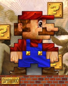
| IT IS I, MARIO. |
Unfortunately, sprites are optimised for their purpose; meaning they'll be charicaturised in funny ways to fit the blocky constraints, and the anatomy doesn't work so well when it's all zoomed in on.
Of course, with a lot of these HD versions they keep the number of animation frames the same. So the graphics might look like the latest uncharted game, but it'll still move like a space invader!
 |
| Help, I have back problems. |
Let's just make a new rule to say that if you can't make it look better, why not just keep it the way it was? It'll save you a bunch of extra work and development costs.
 | ||
| Hello there, stock photoshop texture on the walls. |
You're not doing it right if your 256x192 assets stretched out to the far corners of the world look better than your HD remastering. The texture that's on the walls and the little statue he's holding are practically the same too! Not to mention there is practically zero depth in there because of it.
This is a Capcom game, folks!
 |
| Aran out of ideas. |
Here, I did my own 5-minute attempt at a sprite remaster as an example. See how the anatomy just doesn't work any more when you stick to proportions of the old sprite. Samus' head has no reason to be this big any longer and that arm blaster looks all dinky and weird when it's this short.
Actually, I think that looks pretty good! I kinda like it.
Sigh.
;o; But I DIDN'T put effort into that!
So you made an ugly game, but why do Allie and Tobi consider that to be such a terrible crime?
BECAUSE YOU'RE RUINING OUR FAVOURITE GAMES!

No comments:
Post a Comment